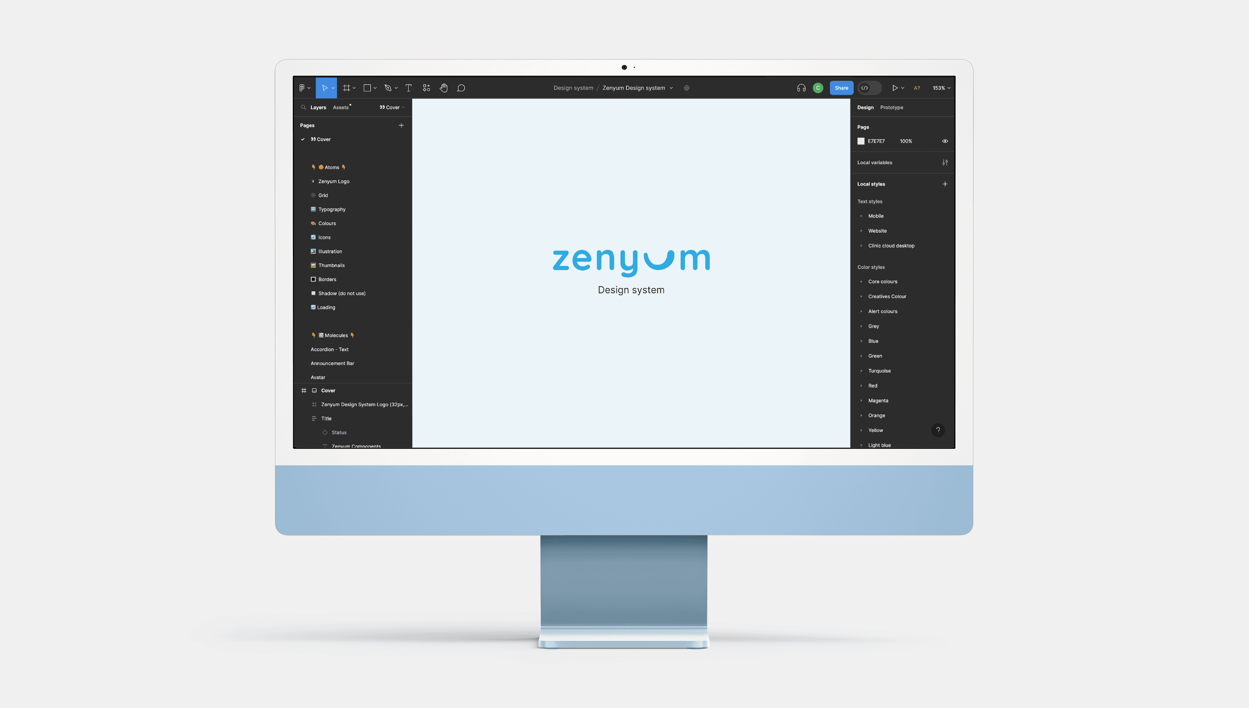
Zenyum Design System is a comprehensive solution developed to address the need for a reusable user interface design system at Zenyum, a leading dental technology company.
Zenyum is a fast-growing dental technology company that offers a variety of products to its customers. With multiple designers working on different projects, there was a growing need for consistency and efficiency in design and development. As a UX designer, I led the initiative to create a comprehensive design system that would serve as a single source of truth for the company's digital products. This case study highlights the challenges faced, the design system's creation process, and the significant outcomes achieved by implementing it.
Challenges and the need for a Design System
Zenyum faced issues with fragmented user experiences due to inconsistent UI standards across their digital products. To foster consistency, efficiency, and a cohesive visual language, the design team realised the importance of a design system. This centralised resource would provide reusable UI components, standardised guidelines, and a foundation for the seamless user experience.
Our goal
The primary objective of the Zenyum Design System was to establish a unified and reusable framework that enabled consistency, efficiency, and scalability across Zenyum's digital products. By streamlining the design and development process and reducing redundancy, the design system aimed to elevate the overall user experience.
Research insights
Identifying challenges
While exploring Zenyum's design practices, I noticed inconsistent UI standards. Designers used individual components, leading to a fragmented design ecosystem lacking visual cohesion. The existing style guide covered basics, like typography and colour, but didn't include a comprehensive design system with reusable components and standardised interactions in Figma.
Incomplete consistency
The usage and implementation of UI components varied across different projects due to the reliance on individual designers' components, resulting in an inconsistent user experience and a lack of visual harmony.
Fragmented design ecosystem:
The absence of a shared component library led to a fragmented design ecosystem, where designers were working in silos and creating isolated solutions, which further exacerbated inconsistencies.
Efficiency concerns
Designers had to invest additional time searching for or recreating components for each project, which led to duplicated efforts, reduced productivity, and an inefficient design process.
Collaboration challenges:

The creation of Zenyum Design System
A Collaborative Adventure 🚀
Taking inspiration from industry-leading design systems
I embraced a best-practice approach in developing the Zenyum Design System. By studying these established systems, I gained valuable insights into component structures, naming conventions, and documentation approaches.

Crafting the Zenyum Design System with Atomic Design Methodology
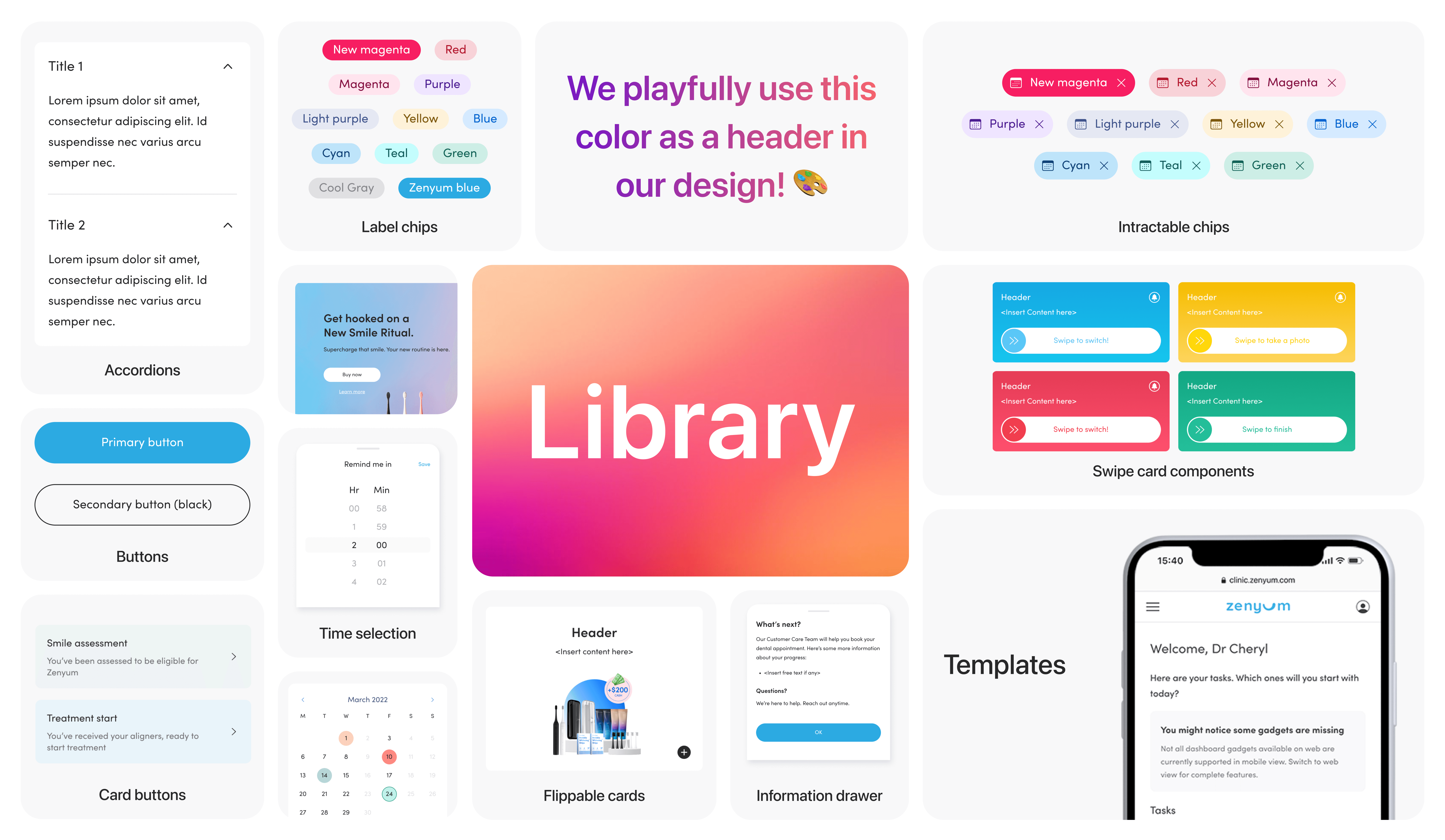
I constructed a comprehensive library of reusable UI components as the foundations of our design system. Drawing on the guidelines and principles from Carbon Design System, Google Material design system and Apple Human Interface Guidelines. I ensured that all components adhere to industry standards and best practices, providing familiarity to both designers and users.


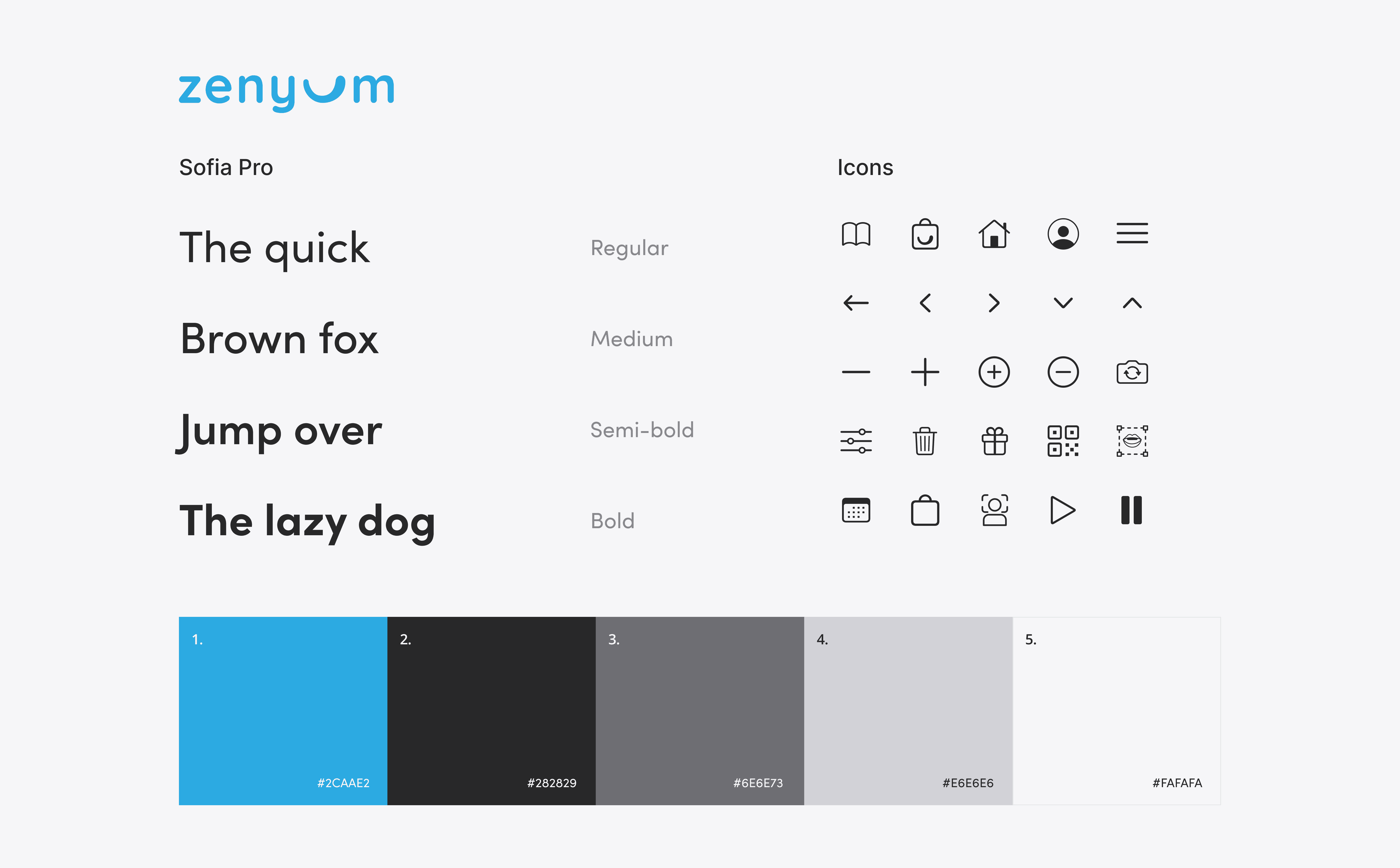
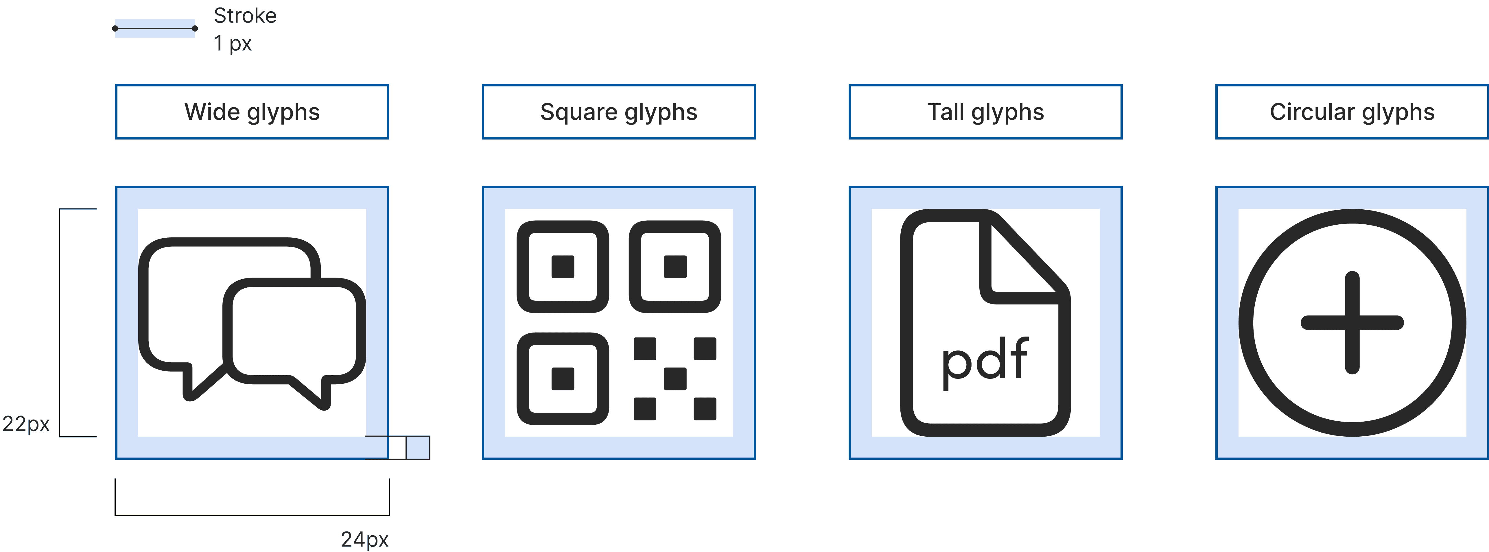
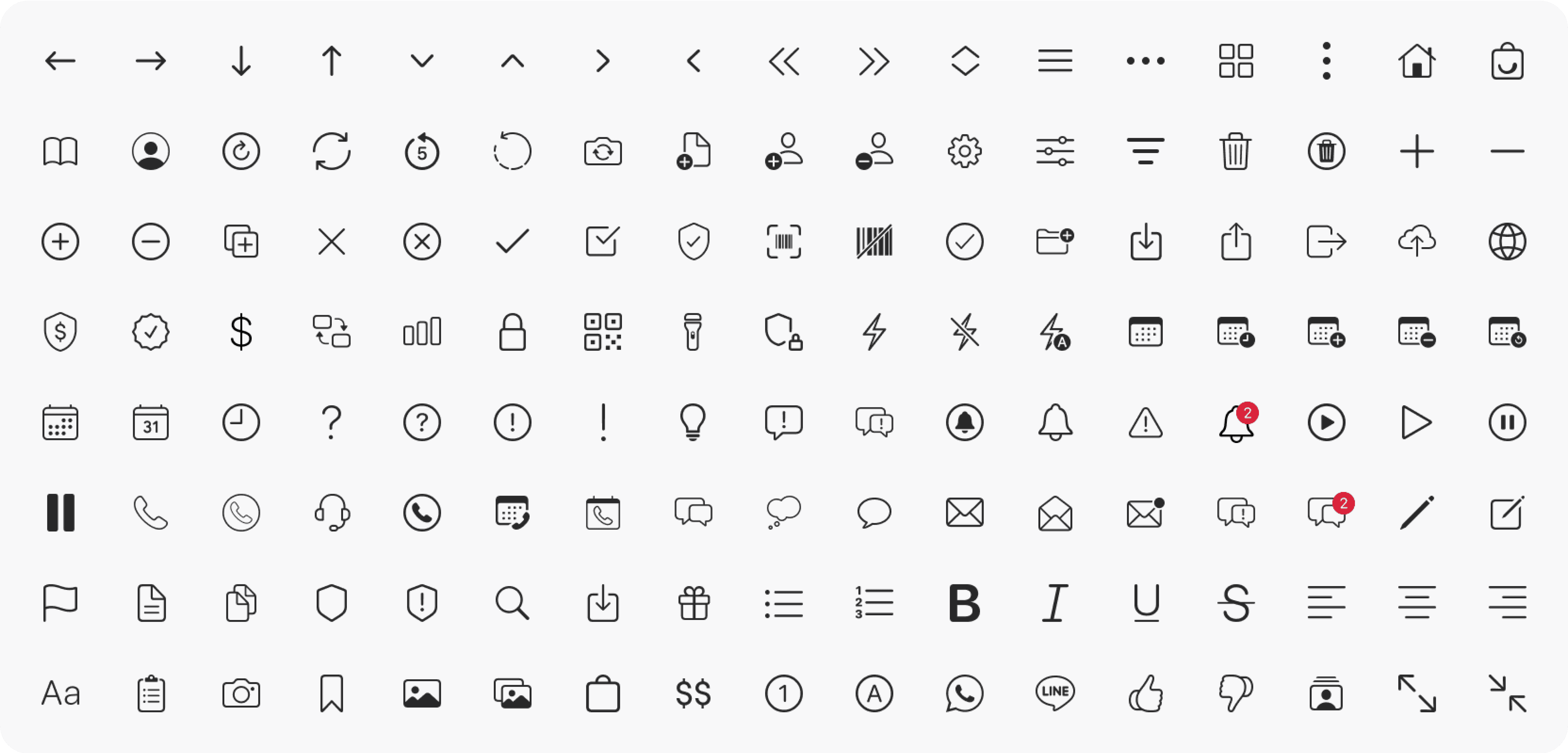
Iconography
In Zenyum's design system, thoughtfully designed and familiar icons serve as visual cues, guiding users to interact with the interface effortlessly. These recognisable icons enhance user experience and reinforce a seamless design language.
Innovative features
Components library
To support our dynamic approach and ensure ongoing consistency, I diligently update the component library each month. This meticulously crafted library of reusable UI components adheres to usability and accessibility standards, offering pre-designed building blocks for diverse digital products, enhancing overall consistency and efficiency.

Documentation hub
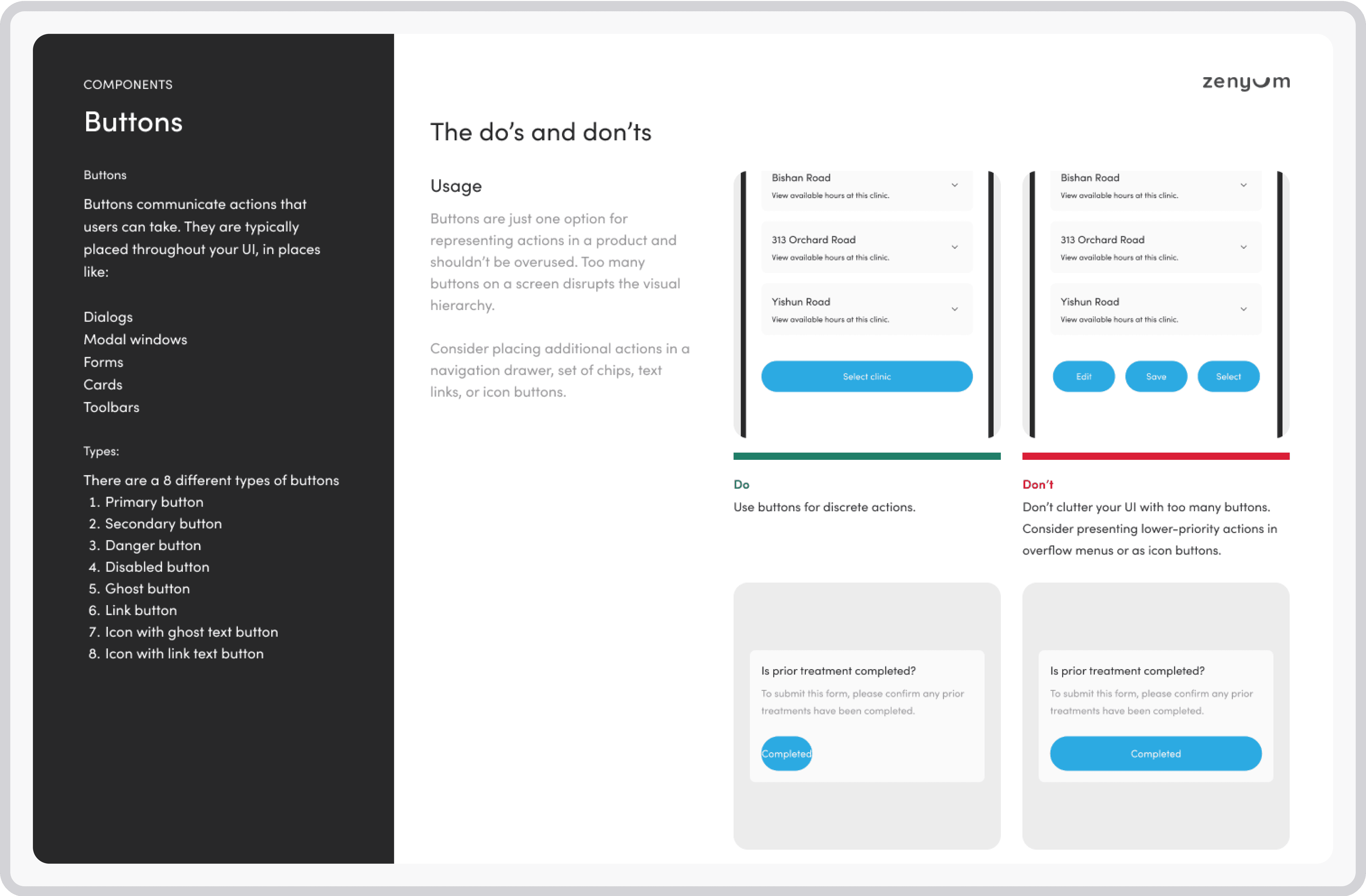
Understanding the usage of each components
I provide detailed guidelines documentations empowers designers and developers, outlining each component's purpose, usage, and implementation. It includes clear do's and don'ts, ensuring adherence to design principles and a seamless user experience across Zenyum's products.
Learning
Outcome
Consistency and efficiency
The design system fostered consistency across Zenyum's digital products, resulting in a cohesive user experience. It also reduced the time and effort spent on recreating components, improving overall efficiency.
Time and cost savings
By reusing components and following established guidelines, designers and developers saved valuable time and effort. This led to increased productivity and reduced development costs.
Collaboration and scalability
The design system fostered collaboration between designers and developers with a shared language and resources. It enabled scalability by quickly onboarding new team members to established design standards.
Improved user experience
The design system's focus on usability and accessibility resulted in an improved user experience. Users benefited from consistent and intuitive interactions, leading to increased satisfaction and engagement.