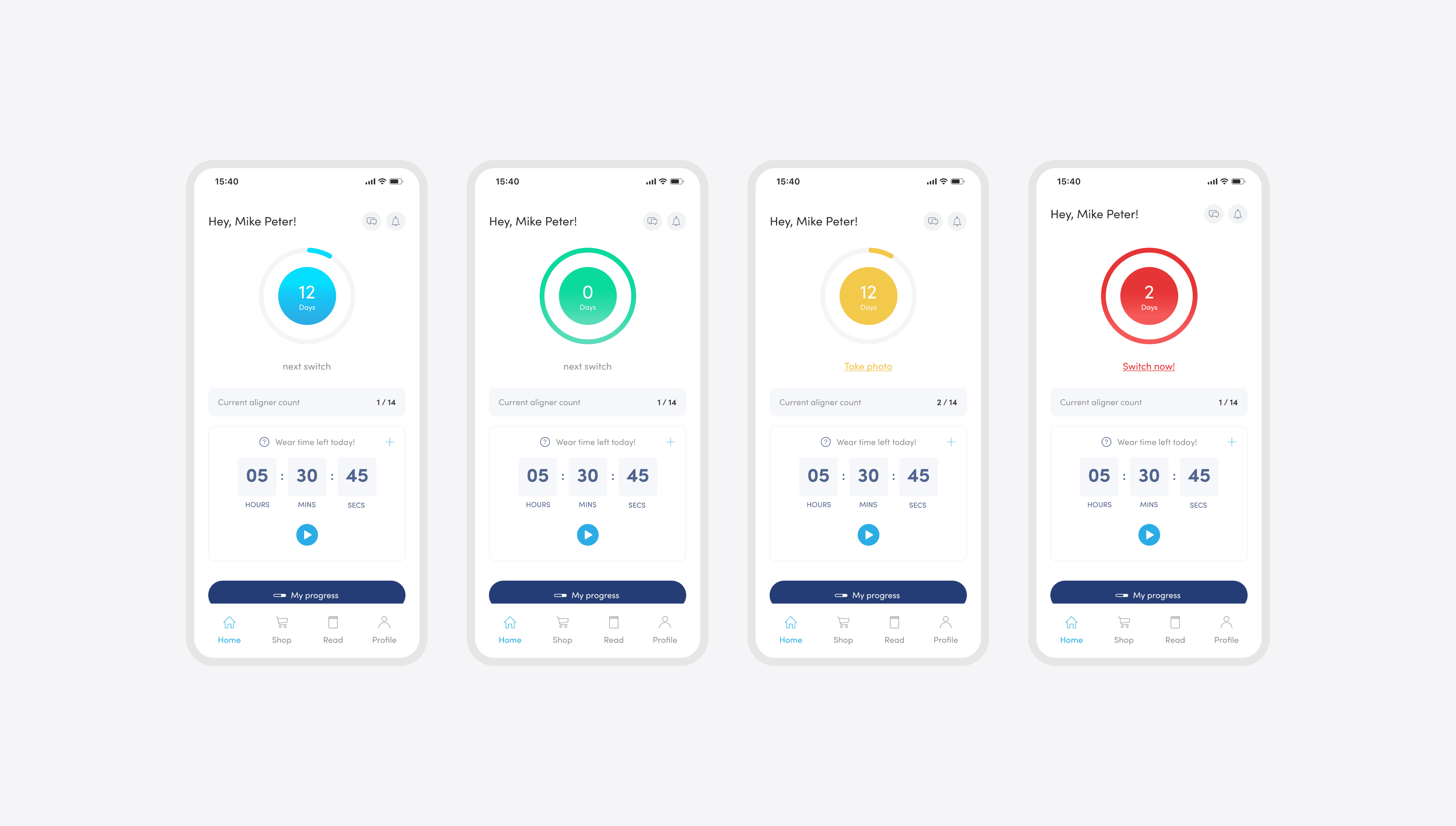
Zenyum — Smart Tracker App is to provide a comprehensive and user-friendly platform that enables patients to track and monitor their aligners' progress. With weekly reminders, users are prompted to change to the next set of aligners at the right time, ensuring effective teeth straightening.
User
Young adults
25 - 35 years old
Role
Product Designer
Type of project
Mobile App
Timeline
6 Months
Zenyum's aligners are virtually invisible when worn and provide a convenient and subtle way to achieve a straighter smile. With remote dental monitoring and treatment planning, users can undergo the teeth-straightening process from the comfort of their homes.
The problem
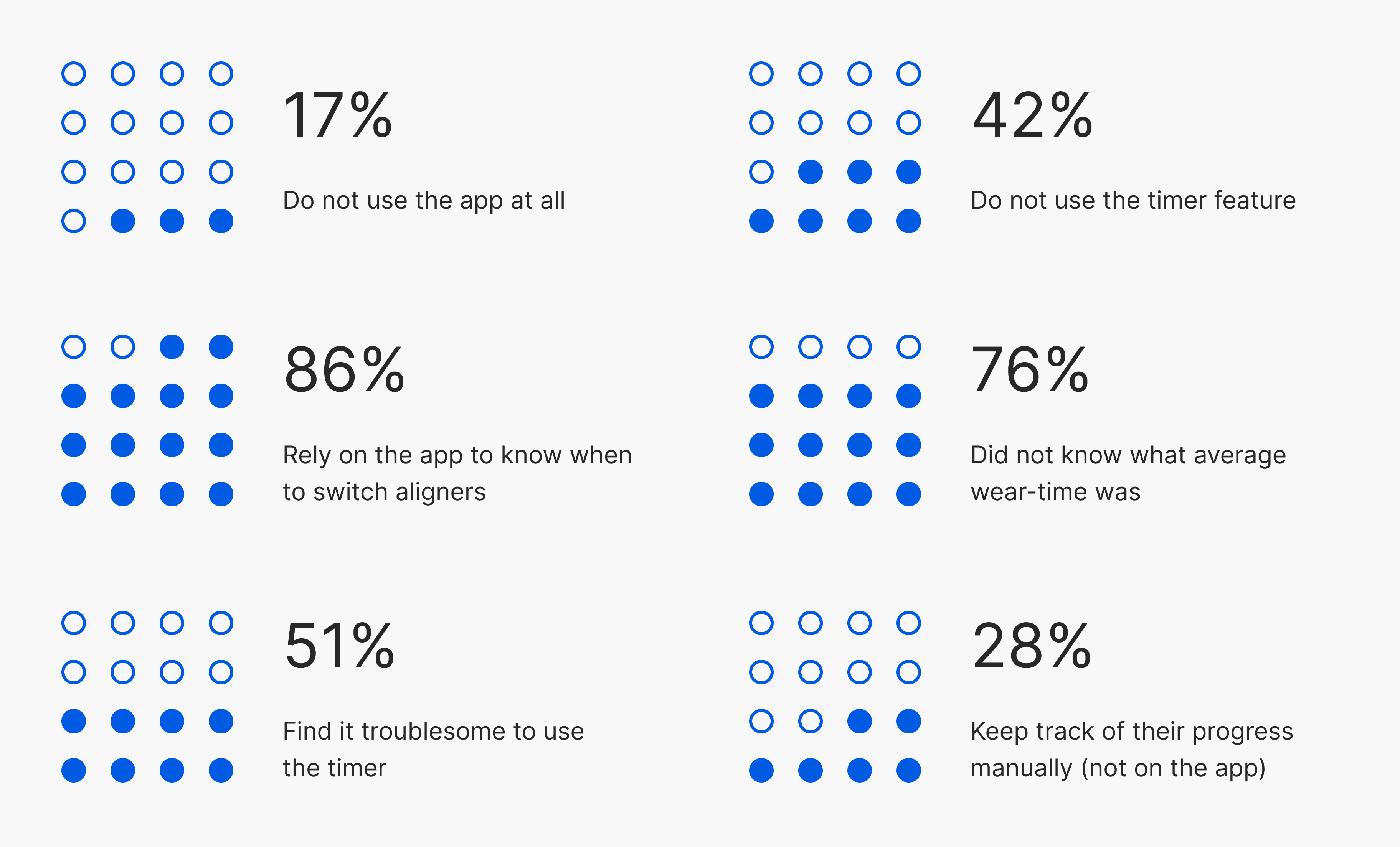
It was discovered that patients didn't utilize the current timer to accurately monitor their wear-time, opting for manual tracking. This may cause issues with precision and wear-time adjustment, potentially impacting treatment results.
How might we…
Provided a completely designed interface that motivated users to monitor wear-time and aligner adjustments efficiently for treatment compliance.
Our goal
Enhance adherence: Increase app usage and timely aligner switches.
Universal usability: Make it intuitive for all.
Elevate user satisfaction with innovative and enhanced user experience.
Design solutions
Elevate user experience with flexible wear-time adjustments, seamless tracking, and real-time monitoring. Empowering users with precision and ease to attain their desired smile results effortlessly.
View final solutions
How did it perform?
Research
Wear time information
Picking up the pieces
Performed a study on 590 current app users to monitor their usage, evaluate the efficiency of the current tracker, and pinpoint areas needing enhancement.
User interviews
Are they happy with the current state?
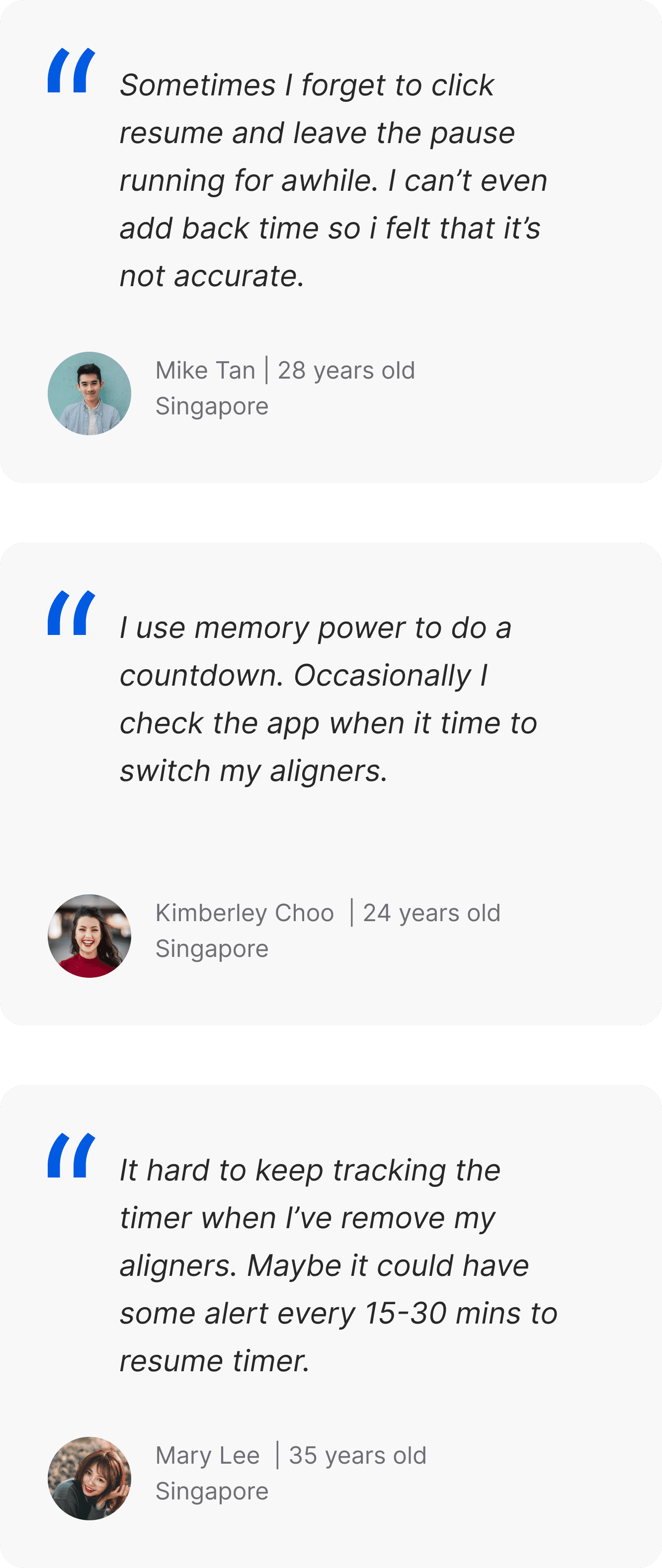
A series of in-depth interviews were then conducted with 5 participants to further identify pain points, frustrations, needs, and desires with existing products to determine how we could improve their experience.
Research
Insights and takeaways
App reliance and counter confusion
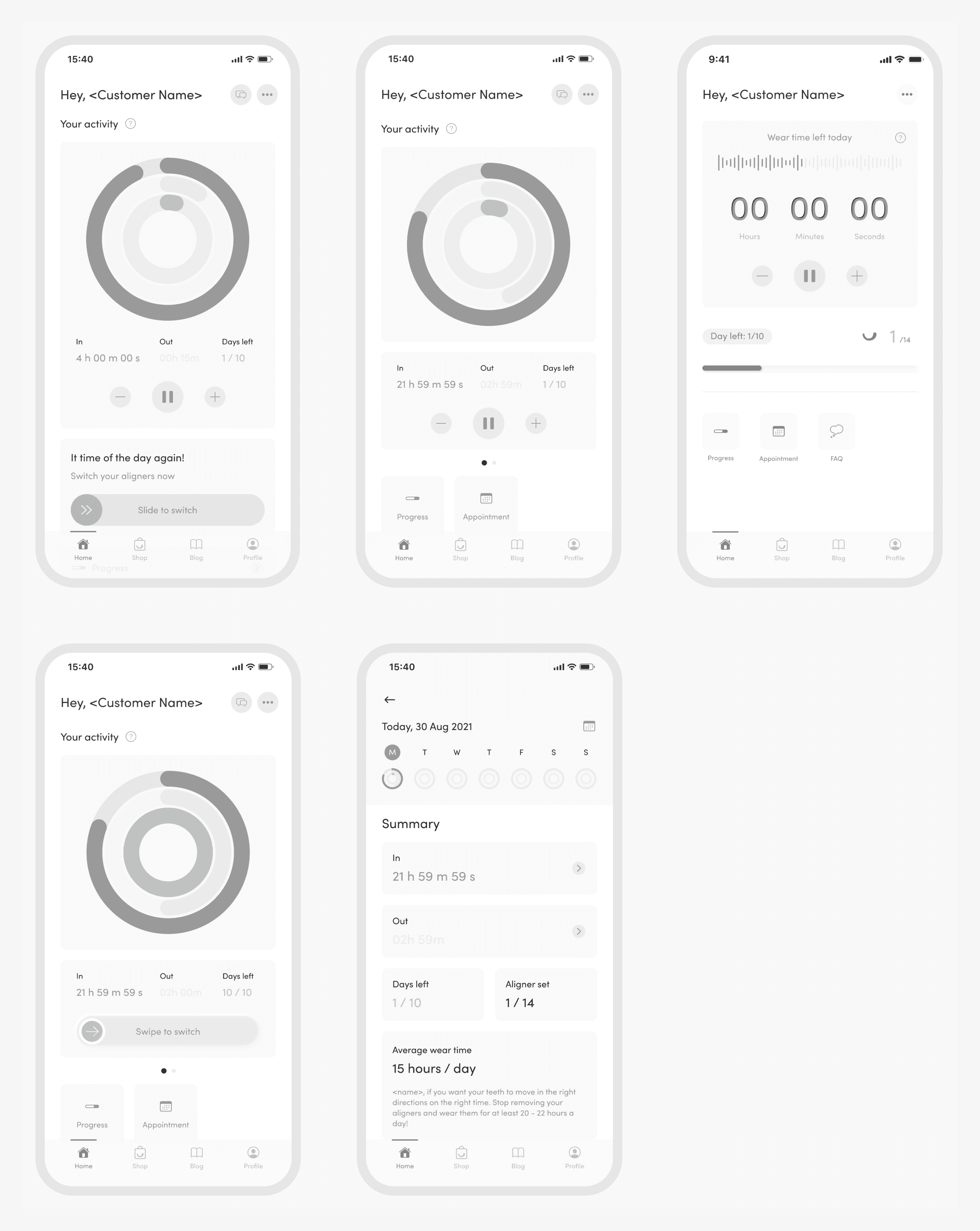
Our users heavily rely on the mobile app to get reminded about their aligner switch dates. However, many users have expressed confusion regarding the visual display of the day counter.
Accuracy issues with aligner wear time tracking
Our users rely on the timer, but frustration mounts as inaccuracy data persists. User have limited editing capability impacts aligners wear-time tracking.
Challenges with timer readability
User frustration mounted with the countdown timer, making it challenging to accurately track aligner wear hours, especially when adding time.
Innovative use of activity rings
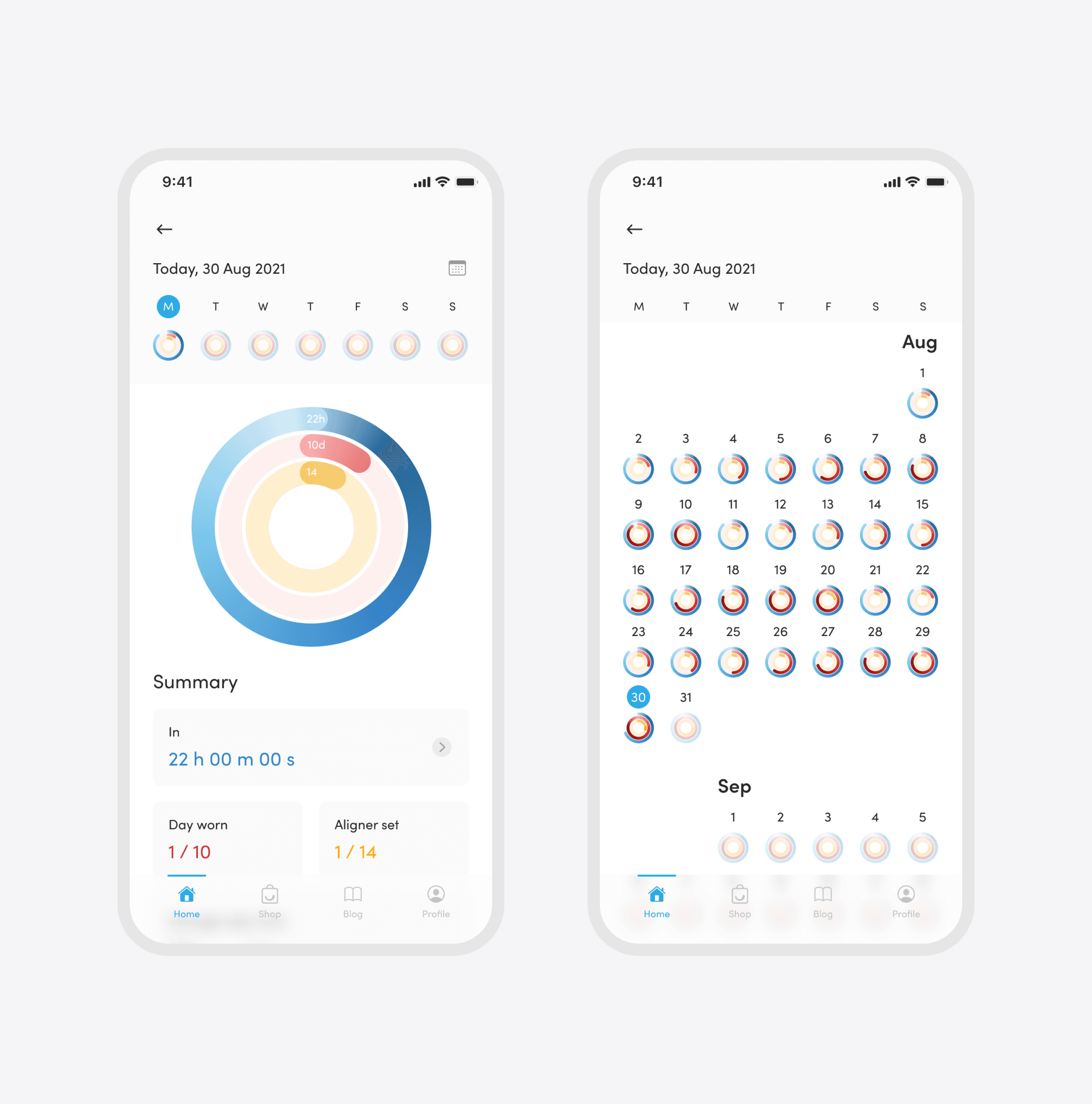
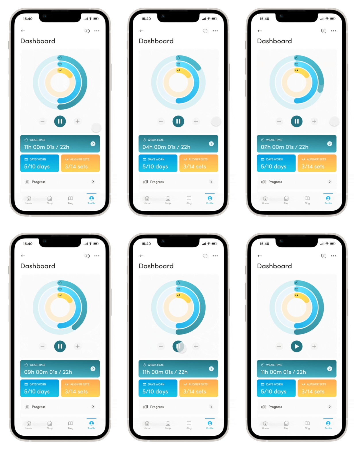
Inspired by Apple's Fitness app, I created visually engaging elements to track user progress and achievements. The rings add a gamified touch, motivating users on their journey towards goals, resulting in a compelling and goal-driven user experience.
Exploration of different visual colours
I explored various colour palettes to enhance the user experience of a digital product, analysing their impact on emotions and interactions. Creating multiple design prototypes with distinct colour schemes, I aimed for an aesthetically pleasing and emotionally resonant user interface. Each design ensured a cohesive and consistent experience for users.
Your journey begins here, the onboarding flow
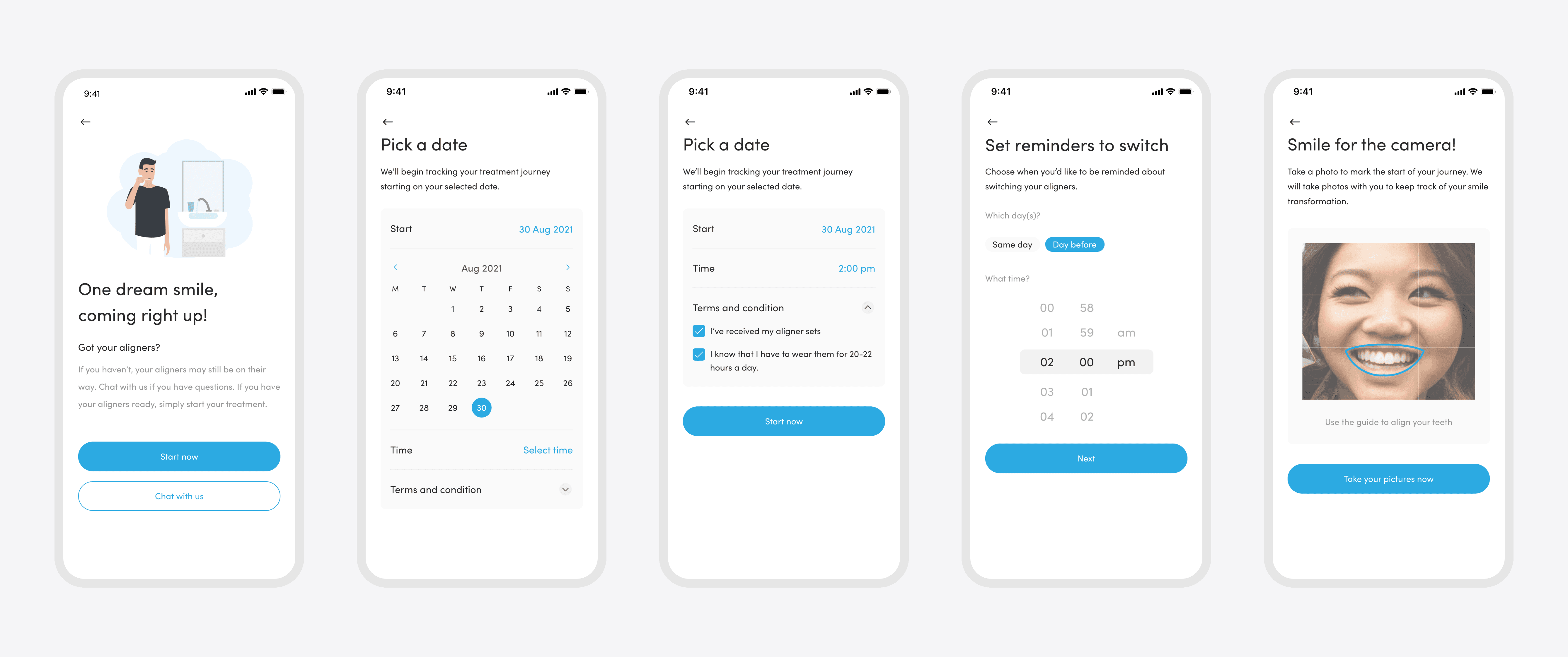
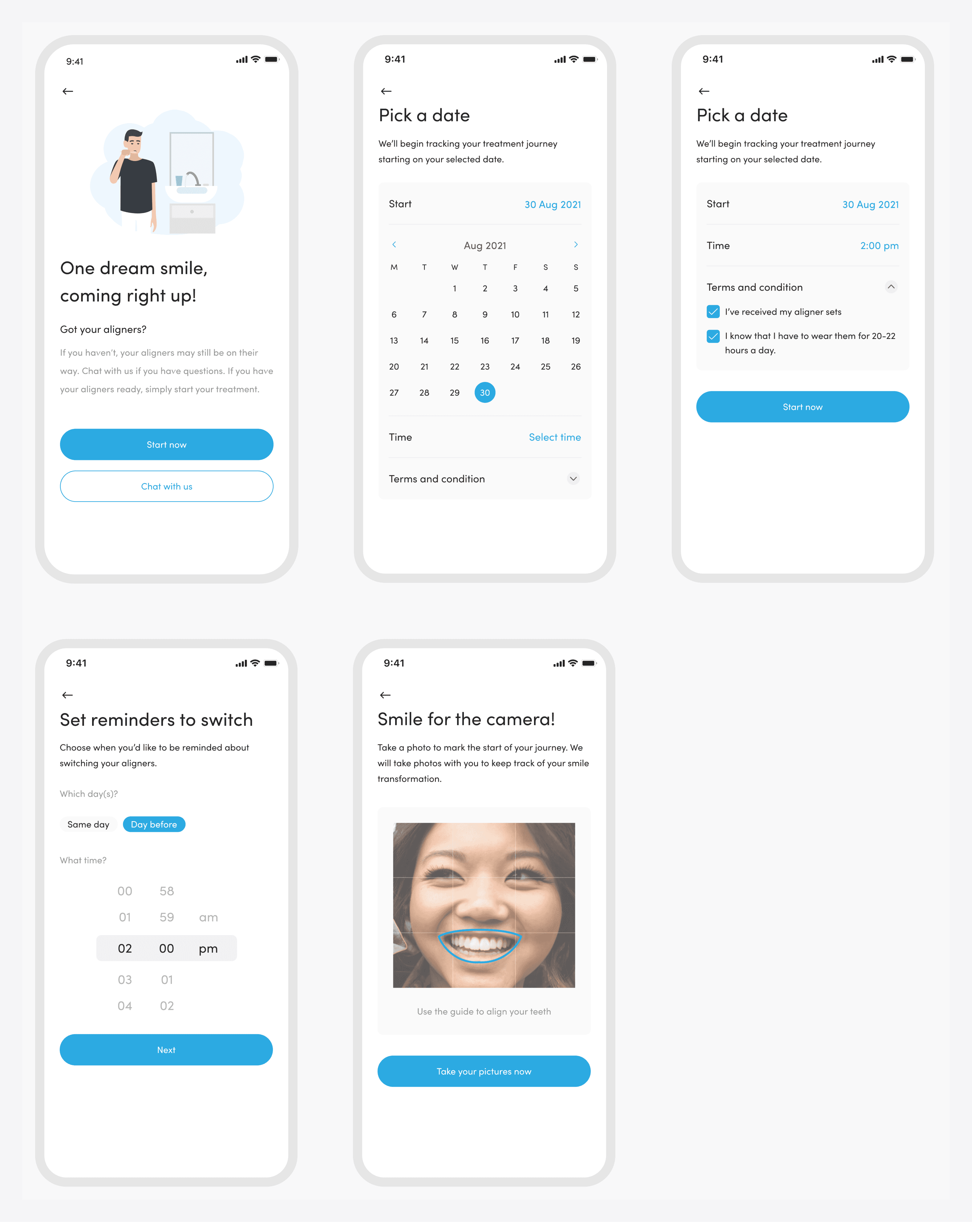
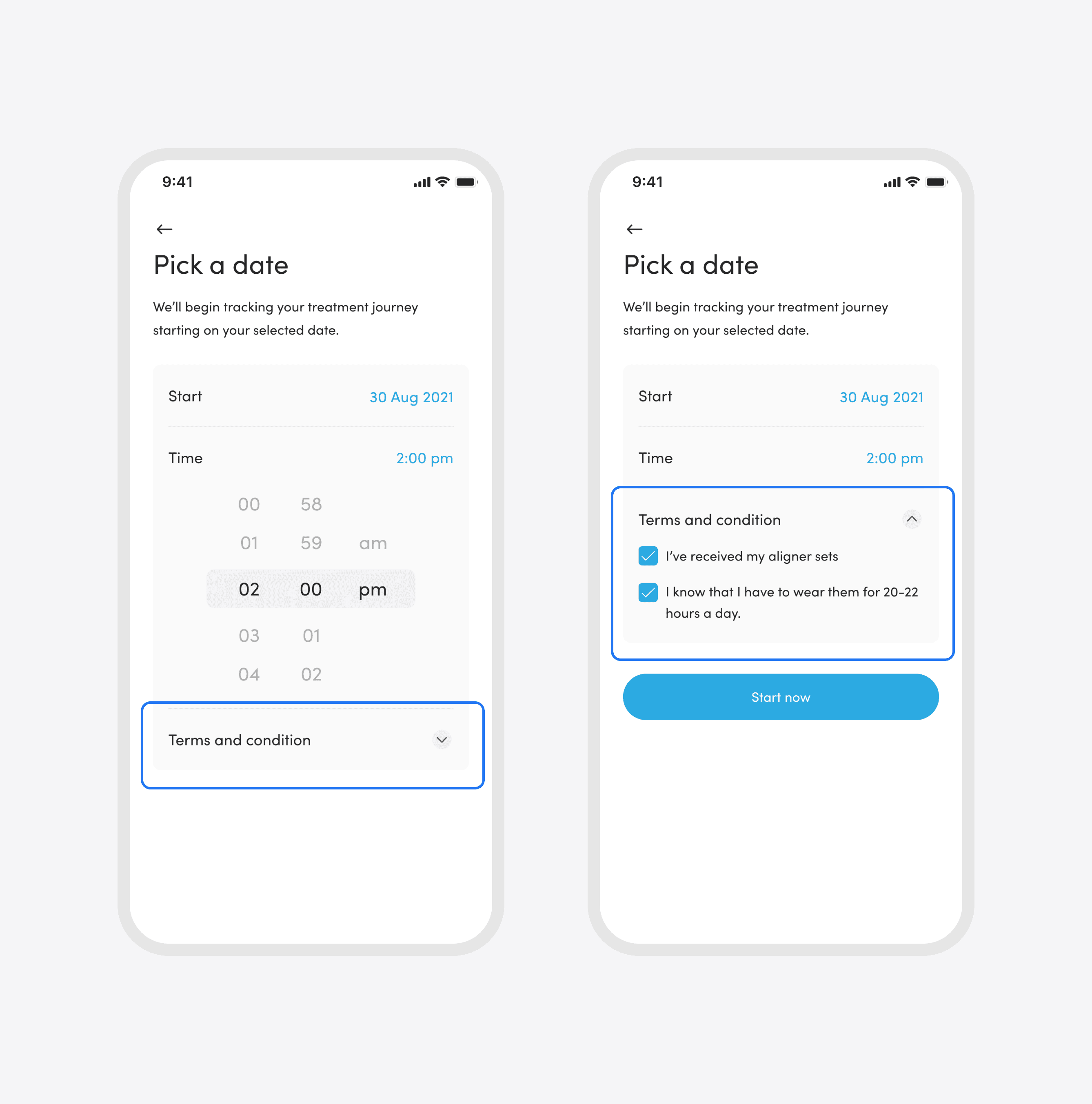
The user's journey sets sail after their dental appointment (Aligner fitting). During the onboarding flow, users can easily jot down the start date and time of their fitting, while also capturing a picture of their own teeth.
Research
User testing (Remote)
3 Rounds of Usability testing
Usability testing was conducted to evaluate the app's design and functionality from the perspective of existing aligner users. The main goals of usability testing were to identify potential usability issues, gather user feedback, and make iterative improvements to enhance the overall user experience.
A/B Testing on Smart tracker dashboard
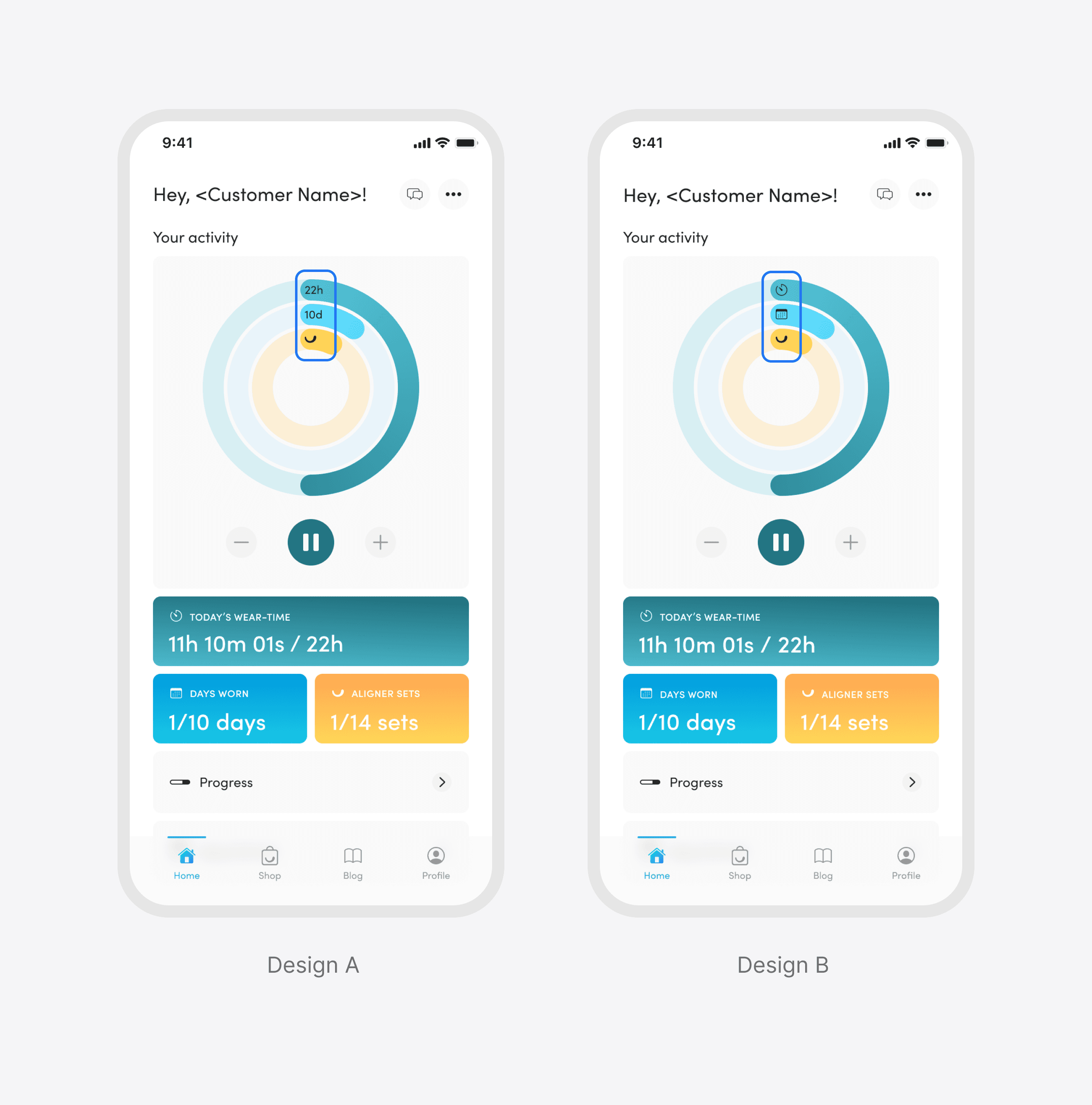
A/B testing was conducted to compare two sets of icons used within the app's interface and assess how well participants could link the icons to their respective functions. The test aimed to identify any potential issues with icon recognition and make informed decisions on which icon set to implement in the final app design.
Design A
Participants felt that the the aligner set icons was not clear and as it not showing people that the optimal wear time is 22 hours.
Design B
Participants are able to connect the colours and icons to the cards below.
Onboarding flow
Our user was able to complete the whole onboarding flow without any usability problems.
Feedback
Participants expressed that the terms and conditions were concealed, leading them to believe it was optional, as there was no prompt
The "Terms and Conditions" copy was written in a confusing manner, possibly discouraging users from clicking on it.
Suggestion
Consider removing the "Terms and conditions" from the collapsible section and renaming the title to something more user-friendly, such as "Guidelines" or "Usage Agreement." This could make the information more accessible and encourage users to engage with it.
Accessing past day wear time
Participants encountered a major usability issue while trying to access past days' wear time, as the non-clickable cards prevented them from viewing the information.
Feedback
Participants took a longer time and more probing to access past day wear time during the UT session.
Suggestion
Consider including a prompt, add visual cues to the cards, and choose one that best represents wear time to allow easy tapping for accessing past-day wear time.
Research
Outcome
Timer logic enhancement
Participants found the updated timer logic intuitive, enabling effortless wear time adjustments without calculations.
Dashboard improvements
Users linked the rings and icons to the information card below, creating an aesthetically pleasing and user-friendly experience.
Seamless aligner switching
Users found aligner switching effortless and straightforward, with reminders appearing only when needed, reducing cognitive load.
Final design
Timer dashboard
Outcome
How did it perform?
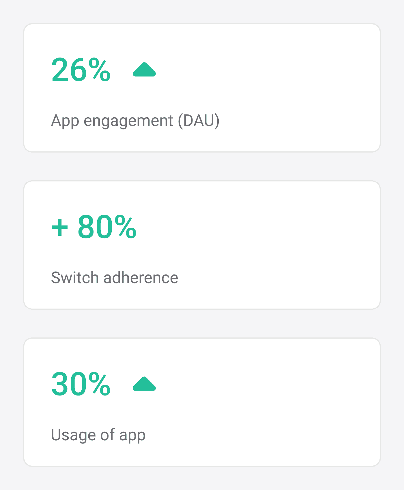
Since then, we have seen an increase of 26% in app engagement (DAU). Since the release, we’ve also seen about 20% increase in switch adherence the following month. The switch adherence rate has been hovering around the 80%+ the following months.
Learning
Outcome
Importance of user-centered design
I learnt that putting users at the center of the design process is crucial. By understanding their needs, pain points, and behaviours, designers can create a product that aligns with users' expectations, leading to higher user satisfaction and engagement.
Data-Driven Decision Making
A/B testing and performance metrics provide objective data to evaluate design choices and measure the app's success. I learnt that Data-driven decision-making minimizes subjective biases and ensures design improvements are based on tangible results.
